Store aesthetics directly affect customer return rates. Research shows 52% of shoppers will not return to a store based on aesthetics alone.
Grocery store colors create environments that attract customers and encourage purchases. Studies indicate 85% of shoppers place color as a primary factor in purchase decisions [8]. This design element drives revenue in an industry worth $841.6 billion in 2023.
Store colors and grocery store paint colors serve purposes beyond decoration. Proper color selection draws customers while reinforcing brand messages. Vibrant colors like yellow and red attract customer attention and increase sales potential [9]. Supermarket racks with effective designs create positive shopping environments.
Color schemes set mood, establish comfort levels, and influence purchase behavior. Kelly green in produce sections evokes freshness and vitality. This guide covers color-matching methods for supermarket interiors and shelves. The information focuses on creating environments that improve shopping experiences through practical color application.
Understanding the Role of Color in Supermarket Design
Color functions as a primary tool for retail fixture manufacturers and store designers. Research data shows 62% to 90% of consumers judge retail environments based on colors within 90 seconds of store entry. This immediate visual assessment makes color selection critical for supermarket design specifications.
Why color matters in retail spaces
Grocery store visual environments communicate with customers beyond basic decoration purposes. Color applications transform retail centers into strategic marketing environments that attract and retain customers rather than serving only as transaction spaces.
Color provides fundamental sensory input that shoppers use to process environmental information. This information affects customer perception of products, store quality, and shopping experience.
Color applications establish and reinforce store character. Proper color implementation creates brand experiences, triggers specific emotions, and directs customer movement from entry to purchase completion. Color selection becomes essential for effective supermarket design.
How color influences shopper behavior
Colors affect customer emotions and purchasing decisions directly. WebFX study data indicates 84.7% of customers use color to drive purchase decisions. Different colors produce specific psychological and physiological responses:
- Warm colors (reds, oranges): Create urgency, increase impulse purchases; red increases appetite and heart rate
- Cool colors (blues, greens): Promote calmness and relaxation, encourage extended browsing periods
- Neutral tones: Convey sophistication and luxury, influence customers toward premium products
Colors manipulate shopper perception through multiple methods. Retail spaces use color to influence desire, affect moods, and alter perceived wait times. Research shows warm shades in waiting zones increase customer comfort and encourage longer store exploration.
Color placement throughout supermarkets creates psychological pathways for customers. Multi-colored fruits and vegetables positioned at store entry create positive sensory experiences with bright colors and healthy associations that prepare customers for increased spending. Bright, contrasting colors direct attention to sales, promotions, and featured products.
Aligning store colors with brand identity
Color application consistency builds brand recognition. Color increases brand recognition by 80%, creating consumer trust that drives sales. Walmart’s logo uses blue to convey dependability while yellow emphasizes friendliness and positivity.
Grocery store color selection requires alignment with intended brand messages. Premium stores use deep, rich colors to convey sophistication and exclusivity. Eco-friendly brands utilize natural tones to communicate sustainability values.
Color consistency across touchpoints—logos, packaging, store interiors—creates visual recognition systems. This alignment ensures customers connect with the brand immediately, reinforcing identity and values.
Supermarkets that incorporate brand colors throughout their spaces create environments that improve shopping experiences and strengthen customer loyalty.
Choosing the Right Color Scheme for Your Store
Color palette selection affects business outcomes. Studies show 93% of purchasing decisions are based on visual appearance, with 73% of in-store purchases influenced by store aesthetics. Grocery store colors create environments that attract customers and guide shopping patterns.
Warm vs cool tones: what works best
Grocery store palettes require a warm and cool tones balance. Warm colors, including red, orange, and yellow, create urgency and energy. These colors encourage quick decisions. These shades increase heart rate and create urgency. Flash sales, discount sections, and attention areas benefit from warm color application.
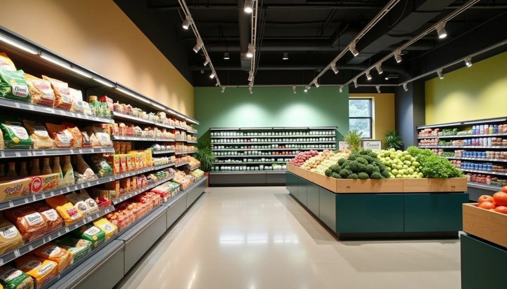
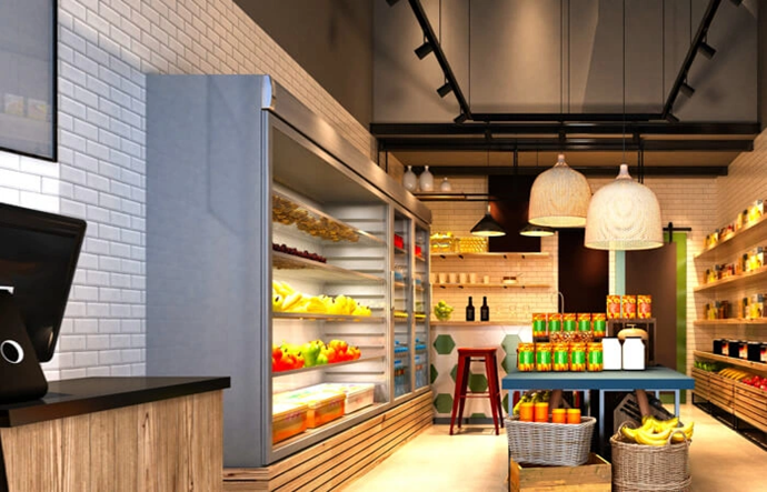
Cool colors like blue and green promote tranquility and trust. Blue conveys calmness and reliability. Areas requiring customer confidence use blue effectively. Green evokes nature, freshness, and sustainability. Produce departments use green as the primary choice.
Strategic placement determines effectiveness. Supermarkets position fruits and vegetables first because green reduces stress and anxiety. This creates positive shopping preparation. Excessive cool colors appear distant or cold. Balance remains essential.
Popular grocery store paint colors
Specific colors prove effective in grocery retail environments:
- Natural Green: Works well in produce departments and eco-friendly sections. Green associates with wholesome organic products and sustainability.
- Warm White: Color temperature around 3,000K makes product packaging appear vibrant. Customers spend more time browsing under warm white lighting.
- Orange and Brown: These warm colors complement bakery departments. Colors evoke associations with freshly baked goods.
- Yellow and Red Accents: Yellow catches attention quickly. Red stimulates appetite. Limit these to 20% of store color scheme to avoid overwhelming customers.
- Deep Blue: Creates trust and reliability. Effective in areas requiring customer confidence.
Store sections benefit from specific color temperatures. Warm light with red undertones makes fruits like apples appear appetizing. Cool light makes them look grayish. Paint color decisions must include lighting considerations.
Using color to reflect store positioning (budget vs premium)
Colors communicate store market positioning and target demographics. Budget-focused retailers use blue, orange, and green to signal affordability and value. Blue projects calmness, stability, and smart decision-making. Budget-conscious shoppers appreciate these qualities.
Premium grocery stores use deep, rich colors like black, gold, and deep purple. These create elegance, exclusivity, and premium value. Sophisticated tones communicate quality and refinement that justify higher prices.
2025 color trends for retail spaces show shifts toward personal, warm, and bold tones. Cool neutrals are declining. Rich black, fiery red, caramel brown, and warm beige gain prominence in upscale retail environments. Stores projecting premium images should consider these trending colors.
Store demographic targeting uses color selection. Men prefer blue, green, and black. Women favor purple, blue, and green. Understanding target demographic preferences helps create environments that resonate with core customers.
Color Matching for Shelves and Fixtures

Shelving colors affect product visibility and customer purchasing behavior. Research indicates 93% of consumers prioritize visual appearance and color when shopping. Grocery store colors for fixtures create visual consistency while directing attention to merchandise displays.
Matching shelf colors with wall tones
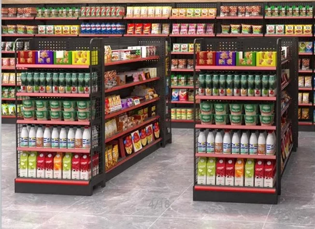
Shelf colors must complement store walls and brand identity for cohesive shopping environments. Neutral-toned shelves, including white, gray, and black, work with most wall colors and highlight product packaging. Light colors like white and beige create open, inviting spaces suitable for smaller stores. Darker tones establish sophisticated, upscale atmospheres.
Maintenance requirements influence color selection. Darker shelving colors hide dust and scratches more effectively than lighter options, providing practical advantages for high-traffic areas. Fixture colors aligned with brand identity reinforce recognition and create seamless customer experiences.
Using contrast to highlight products
Color blocking presents products in contrasting visual arrangements that capture customer attention. This merchandising technique originated in fashion and now impacts product performance on retail shelves.
Contrast ratios between ambient lighting and merchandise create visual hierarchy. 2:1 contrast ratios provide subtle differentiation, while 30:1 ratios produce strong focal effects. Strategic contrast establishes visual zones throughout stores and directs shopper attention naturally.
Best shelf colors for different product types
Product categories require specific shelf color treatments:
- Produce sections: Natural green shelving enhances freshness perception and eco-friendly associations
- Bakery areas: Warm orange and brown tones complement baked goods and evoke comfort
- Premium products: Silver and gold accents create upscale visual cues
- General merchandise: Neutral tones allow colorful packaging to stand out
Examples of effective shelf color combinations
Proven shelf color pairings include:
- Charcoal gray shelving with bright accent colors for sophisticated energy
- Mint green fixtures against wooden backdrops for natural, eco-friendly appeal
- Yellow and red combinations limited to 20% of store area for appetite stimulation
- White shelving with colored trims for personalization without overwhelming spaces
Color selection affects customer product perception and purchasing decisions beyond visual appeal.
Customizing Racks and Displays with Brand Colors
Companies achieve up to 80% increased brand recognition through effective integration of signature colors into retail displays [15]. Visual consistency creates customer connections that transform shopping experiences into brand reinforcement opportunities.
Incorporating grocery store logo colors
Strategic incorporation of logo colors into supermarket fixtures establishes a cohesive brand identity throughout shopping environments. Consistent presentation of brand elements increases revenue by 23%. Displays require colors that complement store logo palettes. Walmart uses blue for dependability and yellow for friendliness. Store owners benefit from limiting color schemes to two or three signature hues for visual clarity and brand recognition.
Color coding by product category
Color coding assists customer navigation through store sections. Bright colors in bakery areas stimulate appetite. Greens in produce sections convey freshness. This organizational approach creates visual zones for intuitive product grouping. Color-coded areas function as wayfinding systems, reducing customer frustration and increasing shopping efficiency.
Tips for using accent colors on end caps and gondolas
End caps represent prime merchandising real estate. High-visibility locations benefit from:
- Bold, vibrant colors for immediate attention attraction
- Brand-consistent color schemes for identity reinforcement
- Red accents for excitement and urgency stimulation
Accent colors require sufficient contrast against primary store colors. End cap displays allow creative freedom for complementary elements that enhance visibility without overwhelming shoppers. Effective displays maintain brand consistency while using color psychology principles for purchasing decision influence.
Practical Tips for Implementation
Color strategy implementation requires methodical testing and consistent application. Research shows 92.6% of customers choose products based on visual factors during the shopping experience.
Testing color palettes before full rollout
Color schemes require testing in specific store areas before storewide implementation. This approach allows tracking of sales data and consumer behavior patterns. Color variations impact purchasing decisions through measurable changes in customer response. Test colors under actual store lighting conditions, as fluorescent lighting, LEDs, and natural light produce different color appearances. Employee and customer feedback provides additional data during testing phases.
Working with designers and paint professionals
Retail space design requires planning that considers brand personality and customer preferences. Color specialists should participate early in the design process before concept finalization. This collaboration ensures store colors meet industry standards and support brand identity objectives.
Maintaining consistency across store sections
Consistent color application creates unified shopping environments that strengthen brand recognition. Primary color schemes should extend throughout entire stores, covering walls, décor, product displays, and packaging. Multiple store locations require standardization through clear benchmarks and quality control systems.
Avoiding common color mistakes
Color palettes should limit to three core colors plus one or two accent colors. Cultural color associations vary across different demographics and require consideration during selection. Lighting differences can alter color appearance significantly, making proper lighting evaluation essential during color selection.
Conclusion
Color serves as a critical tool in supermarket design strategy. This guide covers color selection methods that transform shopping environments into retail spaces that drive customer engagement and increase sales.
Grocery store colors influence purchasing decisions, affect shopping duration, and shape brand perception. Color combinations make products appear more attractive while strengthening brand identity.
Store sections benefit from specific color treatments. Produce departments use fresh greens. Bakery sections employ warm oranges and browns. Premium areas utilize deep, rich tones. These choices create shopping zones that guide customers through their journey.
Shelf and fixture colors frame merchandise effectively. Neutral-toned shelving provides versatility. Strategic contrast highlights featured products. Color blocking techniques draw attention to specific items and create visual focus areas throughout the store.
Brand color integration across displays reinforces recognition and builds customer loyalty. Consistency creates cohesive shopping experiences.
Store owners should implement color methodically. Test palettes in specific areas before full rollout. Work with color specialists who understand retail environments. Small-scale experimentation allows retailers to gather feedback before committing to storewide changes.
Color matching for supermarket interiors and shelves requires a balance between brand identity and product visibility. Retailers who master this balance create environments where customers spend more time and money. Strategic color application transforms grocery trips into shopping experiences that encourage customer return visits.
Key Takeaways
Strategic color selection in supermarkets directly impacts customer behavior, with 93% of purchasing decisions influenced by visual appearance and proper color schemes increasing sales significantly.
• Color drives immediate decisions: 62-90% of customers judge stores within 90 seconds based on colors, making first impressions crucial for retail success.
• Warm colors create urgency, cool colors encourage browsing: Red and orange stimulate quick purchases, while blue and green promote relaxation and longer shopping times.
• Strategic shelf colors enhance product visibility: Neutral shelving makes colorful packaging pop, while contrast ratios of 2:1 to 30:1 effectively highlight featured merchandise.
• Brand color consistency increases recognition by 80%: Integrating logo colors throughout displays and fixtures strengthens brand identity and customer loyalty.
• Test before full implementation: Experiment with color palettes in specific store sections under actual lighting conditions to measure impact on sales and customer behavior.
The most successful supermarkets balance warm and cool tones strategically—using greens in produce sections to convey freshness, warm colors in bakery areas to stimulate appetite, and neutral tones for general merchandise to let products shine. Remember that effective color matching goes beyond esthetics; it creates psychological pathways that guide customers through their shopping journey while reinforcing your brand’s identity and values.
FAQs
Q1. What is the importance of color in supermarket design? Color plays a crucial role in supermarket design, influencing customer behavior and purchasing decisions. It can create a welcoming atmosphere, guide shoppers through the store, and even increase sales. Studies show that up to 90% of consumers judge a retail environment based on colors within the first 90 seconds.
Q2. How do warm and cool colors affect shoppers differently? Warm colors like red and orange create a sense of urgency and excitement, potentially increasing impulse purchases. Cool colors such as blue and green promote calmness and relaxation, encouraging customers to spend more time browsing. The strategic use of both can create an optimal shopping experience.
Q3. What are some popular color choices for grocery store interiors? Popular colors include natural green for produce sections, warm white for general areas, orange and brown for bakery departments, and accents of yellow and red for attention-grabbing displays. Deep blue is often used to convey trust and reliability in certain store areas.
Q4. How can shelf colors impact product visibility? Shelf colors can significantly impact product visibility. Neutral-toned shelves like white, gray, or black allow products to stand out. Using contrast effectively, such as dark shelves for light products or vice versa, can draw attention to specific items. Color blocking techniques can also be used to create visual interest and highlight certain product categories.
Q5. Why is it important to incorporate brand colors in store design? Incorporating brand colors throughout the store design helps reinforce brand identity and increases recognition. Consistent use of brand colors in fixtures, displays, and signage can boost brand recognition by up to 80% and create a cohesive shopping experience that resonates with customers, potentially increasing loyalty and sales.